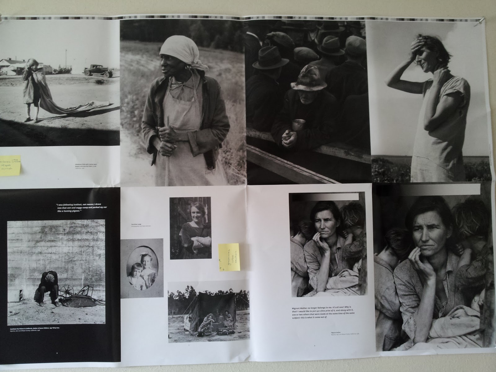
Dorothea Lange is in the final prepress stages. Caitlin Kirkpatrick at Chronicle Books sent me one huge page of what the printer is coming up with, using the paper and ink we'll have for the book. A few of the images were too dark, so the next day I went in to Chronicle -- the joy of having a publisher a short BART ride away!
 |
| Sheet of pages for color correction |
I worked with the production coordinator,
Yolanda Cazares, and the editorial assistant, Caitlin Kirkpatrick, on figuring out the best way to show Dorothea's photos. We were going to do duotone, but there were just not enough mid-tones, so Chronicle is doing tritone! Do you know how gorgeous this will be?
 |
| Yolanda Cazares and Caitlin Kirkpatrick in the worlds best-ever, walk-in light box |
Yolanda is using two blacks and a third color to add the tonal range they want. In her words, "not sepia, but a touch of gold." See how hard it is to talk about color using words? After the printer lays down the ink, the whole thing gets a very light coating of varnish, which adds to the warmth of the image.
This is the next best thing to holding an actual, archival print in your hands.